Evolution in Anna Spinato Winery!
Last 09th of July 2021 at the amazing Ca ‘Sagredo palace in Venice, Anna Spinato hosted an event dedicated to the Prosecco phenomenon, analyzing numbers and opportunities, telling the story and the territory, explaining how grapes become wine.
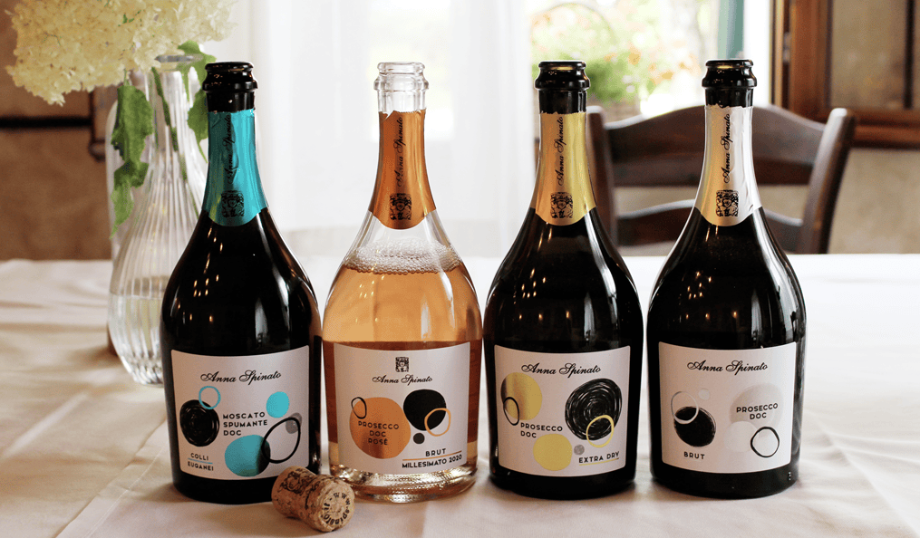
On this special occasion she also presented the new look of her Prosecco DOC.
Anna Spinato has always been at the forefront of image and products, guaranteeing service quality to her professional partners and constantly updated responses to the consumers’ needs.
The evolution in Anna Spinato Winery could only start from the reinterpretation of packaging in a modern and updated key.
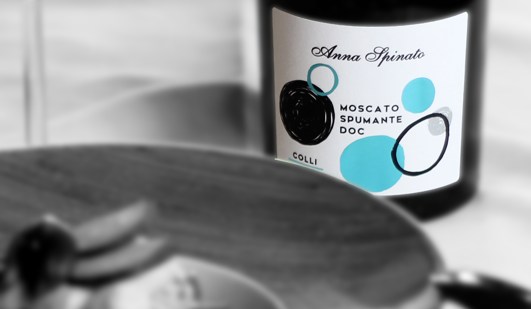
The labels, created by the graphic design studio Valentina Cresti & Associates, want to communicate the freshness of the product, an elegant style that express a fresh and youthful image.
The labels
A minimal and modern style characterized by full and empty circles overlapping each other and recalling the Prosecco bubbles, deliberately irregular in evidence of the “handmade”, of the craftsmanship, the care and genuineness that the company has placed in the product.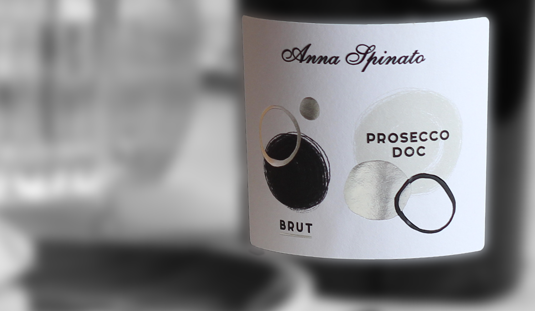
The elegant black returning on all the bottles contrasting a shiny foil which is different on each bottle and connotes the character and soul of the product.
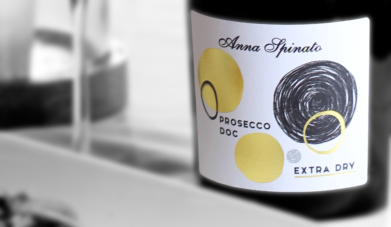
The use of braille, a surface finish in glossy relief that also adds a tactile note on the label: the bottle must communicate emotions also when taken in hand.
